面对开发中遇到的需求,怎么办呢?研究呗!
关联控件
- CoordinatorLayout
- AppBarLayout
- CollapsingToolbarLayout
- RecyclerView
- SwipeRefreshLayout
下面放出全部布局,然后逐一讲解内容实现。
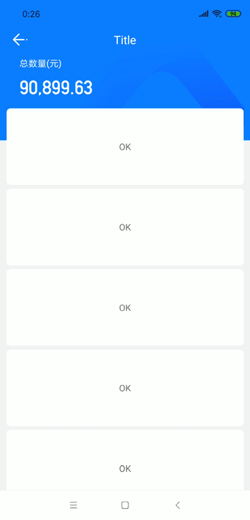
首先看一下完成后的效果:
1
2
3
4
5
6
7
8
9
10
11
12
13
14
15
16
17
18
19
20
21
22
23
24
25
26
27
28
29
30
31
32
33
34
35
36
37
38
39
40
41
42
43
44
45
46
47
48
49
50
51
52
53
54
55
56
57
58
59
60
61
62
63
64
65
66
67
68
69
70
71
72
73
74
75
| <FrameLayout
android:layout_width="match_parent"
android:layout_height="match_parent">
<android.support.design.widget.CoordinatorLayout
android:id="@+id/coo_root"
android:layout_width="match_parent"
android:layout_height="match_parent">
<android.support.design.widget.AppBarLayout
android:id="@+id/app_bar"
android:layout_width="match_parent"
android:layout_height="wrap_content"
android:background="#177FFF">
<android.support.design.widget.CollapsingToolbarLayout
android:layout_width="match_parent"
android:layout_height="180dp"
android:minHeight="74dp"
app:layout_scrollFlags="scroll|exitUntilCollapsed|enterAlwaysCollapsed"
app:statusBarScrim="@android:color/transparent">
<ImageView
android:id="@+id/iv_bg"
android:layout_width="wrap_content"
android:layout_height="wrap_content"
android:layout_gravity="center"
android:scaleType="fitXY"
android:src="@drawable/ic_bg_logo"
app:layout_collapseMode="parallax"
app:layout_collapseParallaxMultiplier="0.9" />
<com.dwzq.market.view.trade.reversebond.ExtendToolbar
android:id="@+id/tv_title"
android:layout_width="match_parent"
android:layout_height="74dp"
app:contentInsetStart="0dp"
app:layout_collapseMode="pin" />
</android.support.design.widget.CollapsingToolbarLayout>
</android.support.design.widget.AppBarLayout>
<android.support.v7.widget.RecyclerView
android:id="@+id/rv_hold_list"
android:layout_width="match_parent"
android:layout_height="match_parent"
android:paddingLeft="10dp"
android:paddingRight="10dp"
app:behavior_overlapTop="50dp"
app:layout_behavior="@string/appbar_scrolling_view_behavior" />
</android.support.design.widget.CoordinatorLayout>
<TextView
android:id="@+id/tv_total_name"
android:layout_width="wrap_content"
android:layout_height="wrap_content"
android:layout_marginLeft="30dp"
android:layout_marginTop="49dp"
android:text="总数值"
android:textColor="@color/p_white"
android:textSize="14sp" />
<com.dwzq.market.widget.textview.DigitsFontTextView2
android:id="@+id/tv_total_value"
android:layout_width="wrap_content"
android:layout_height="wrap_content"
android:layout_marginLeft="30dp"
android:layout_marginTop="79dp"
android:text="90,899.63"
android:textColor="@color/p_white"
android:textSize="30sp" />
</FrameLayout>
|
折叠部分
首先折叠动效,在MaterialDesign中有类似的实现,就是CollapsingToolbarLayout。
CollapsingToolbarLayout需要被CoordinatorLayout,AppBarLayout包裹后才可正常使用。
这里面需要注意几个参数:
背景图片部分
由于需求中,Toolbar上存在背景图片,并且需要在折叠中依旧浮动在Toolbar上,设置如下。
在CollapsingToolbarLayout中,第一个子布局放置ImageView做为背景,同时根据需求调整gravity等属性。
需要特殊提示的属性:
-
android:scaleType
这里面有很多选项,具体需要查阅文档。
- fitXY
可以不用保持图像的宽高比,从控件的左上角分别对图片的宽和高进行缩放
- centerCrop
保持图像的宽高比,进行缩放图像
-
app:layout_collapseMode="parallax"
视差模式,在折叠的时候会有个视差折叠的效果
-
app:layout_collapseParallaxMultiplier="0.9"
设置视差范围,0-1越大视差越大
由于需求中的Toolbar比常规工具栏多出一部分,用于放置缩小折叠后的值。那么我们自定义一个Toolbar。
使用时需要注意的参数
app:contentInsetStart="0dp"
在自定义Toolbar时,有时会出现左侧有一段空白无法使用,这时候需要进行设置重置空白。app:layout_collapseMode="pin"
固定模式,收缩到最后固定在顶端。
布局文件
1
2
3
4
5
6
7
8
9
10
11
12
13
14
15
16
17
18
19
20
21
22
23
24
25
26
27
28
29
| <RelativeLayout xmlns:android="http://schemas.android.com/apk/res/android"
android:layout_width="match_parent"
android:layout_height="74dp">
<ImageView
android:layout_width="wrap_content"
android:layout_height="wrap_content"
android:layout_above="@+id/fl_value_bar"
android:layout_alignParentTop="true"
android:layout_marginLeft="20dp"
android:src="@drawable/hq_white_back" />
<TextView
android:layout_width="wrap_content"
android:layout_height="wrap_content"
android:layout_above="@+id/fl_value_bar"
android:layout_alignParentTop="true"
android:layout_centerHorizontal="true"
android:gravity="center_vertical"
android:text="标题栏文字"
android:textColor="@color/p_white"
android:textSize="18sp" />
<FrameLayout
android:id="@+id/fl_value_bar"
android:layout_width="match_parent"
android:layout_height="30dp"
android:layout_alignParentBottom="true" />
</RelativeLayout>
|
自定义Toolbar类文件
1
2
3
4
5
6
7
8
9
10
11
12
13
14
15
16
17
18
19
20
21
22
| public class ExtendToolbar extends Toolbar {
public ExtendToolbar(Context context) {
this(context, null);
}
public ExtendToolbar(Context context, @Nullable AttributeSet attrs) {
this(context, attrs, 0);
}
public ExtendToolbar(Context context, @Nullable AttributeSet attrs, int defStyleAttr) {
super(context, attrs, defStyleAttr);
init();
}
private void init() {
LayoutInflater mInflater = LayoutInflater.from(getContext());
View mView = mInflater.inflate(R.layout.toolbar_reverse_bond, null);
LayoutParams lp = new LayoutParams(ViewGroup.LayoutParams.MATCH_PARENT,
ViewGroup.LayoutParams.WRAP_CONTENT, Gravity.NO_GRAVITY);
addView(mView, lp);
}
}
|
RecyclerView 数据列表部分
在AppBarLayout外,CoordinatorLayout内,放置需要显示的内容,此处可以为NestedScrollView,RecyclerView,但是不推荐使用ScrollView,存在BUG。
当CollapsingToolbarLayout配合RecyclerView使用的时候,可能会存在最后一项显示不完整,可设置CollapsingToolbarLayout属性android:minHeight="?actionBarSize"来解决。
需要介绍的参数:
app:behavior_overlapTop="50dp"
当数据列表需要向上偏移进入CollapsingToolbar部分时,可以设置此参数,向上偏移。app:layout_behavior="@string/appbar_scrolling_view_behavior"
一定需要添加此参数,表示该控件与CollapsingToolbar通过behavior绑定。
最开始考虑是用behavior来操作控件滑动,但是behavior因为需要依附在Toolbar控件上,通过app:layout_anchor,app:layout_anchorGravity来操作位置,但是难以做到我需要的效果。
那么考虑使用FrameLayout + TextView将控件浮在布局上方,监听Toolbar移动位置,从而改变TextView的大小和位置。
首先需要取得控件在屏幕中的位置,由于控件的位置需要Measure,Layout之后才能获得,那么我们创建一个监听树来监听控件加载完毕的回调。
1
2
3
4
5
6
7
8
9
10
11
12
| final ViewTreeObserver viewTreeObserver = getActivity().getWindow().getDecorView().getViewTreeObserver();
viewTreeObserver.addOnGlobalLayoutListener(new ViewTreeObserver.OnGlobalLayoutListener() {
@Override
public void onGlobalLayout() {
oX = mBinding.tvTotalValue.getLeft();
oY = mBinding.tvTotalValue.getTop();
if (Build.VERSION.SDK_INT >= Build.VERSION_CODES.JELLY_BEAN) {
getActivity().getWindow().getDecorView().getViewTreeObserver().removeOnGlobalLayoutListener(this);
}
}
});
|
此时我们就获得了控件距离左侧和上方的位置,之后可以根据折叠后的位置、滑动距离、最大滑动距离,来计算出偏移比例,从而展示出动画效果。
1
2
3
4
5
6
7
8
9
10
11
12
13
14
15
16
17
18
19
20
| appBar.addOnOffsetChangedListener((appBarLayout, verticalOffset) -> {
int totalScrollRange = appBarLayout.getTotalScrollRange();
int absOffset = Math.abs(verticalOffset);
float percent = (float) absOffset / (float) totalScrollRange;
int targetX = DisplayUtils.dp2px(96);
int targetY = DisplayUtils.dp2px(51);
int targetNameX = DisplayUtils.dp2px(20);
if (oX != 0 || oY != 0) {
mBinding.tvTotalName.setX(oX - (oX - (float) targetNameX) * percent);
mBinding.tvTotalValue.setX(oX + ((float) targetX - oX) * percent);
mBinding.tvTotalValue.setY(oY - (oY - (float) targetY) * percent);
mBinding.tvTotalValue.setTextSize(TypedValue.COMPLEX_UNIT_SP, 30f - 14f * percent);
}
});
|
完成以上操作后,就可以实现该动画效果了。此时还可以进行一些扩展功能。比如下拉刷新,全屏模式适配。
扩展:下拉刷新
使用原生方案实现下拉刷新,在布局的根部,使用SwipeRefreshLayout包裹全部布局
1
2
3
4
| <android.support.v4.widget.SwipeRefreshLayout
android:id="@+id/refresh_layout"
android:layout_width="match_parent"
android:layout_height="match_parent"/>
|
由于监听的是下拉时的事件,那么当Toolbar折叠之后的下拉也会被监听到,这并非我所需要的效果,此时需要在addOnOffsetChangedListener中进行一点设置即可。
1
2
3
4
5
6
|
if (verticalOffset >= 0){
refreshLayout.setEnabled(true);
}else {
refreshLayout.setEnabled(false);
}
|
扩展:全屏适配的一些提示点
- fitSystemWindow 针对状态栏适配
- 根布局调整padding
- CollapsingToolbarLayout设置状态栏折叠时颜色
app:statusBarScrim="@android:color/transparent"